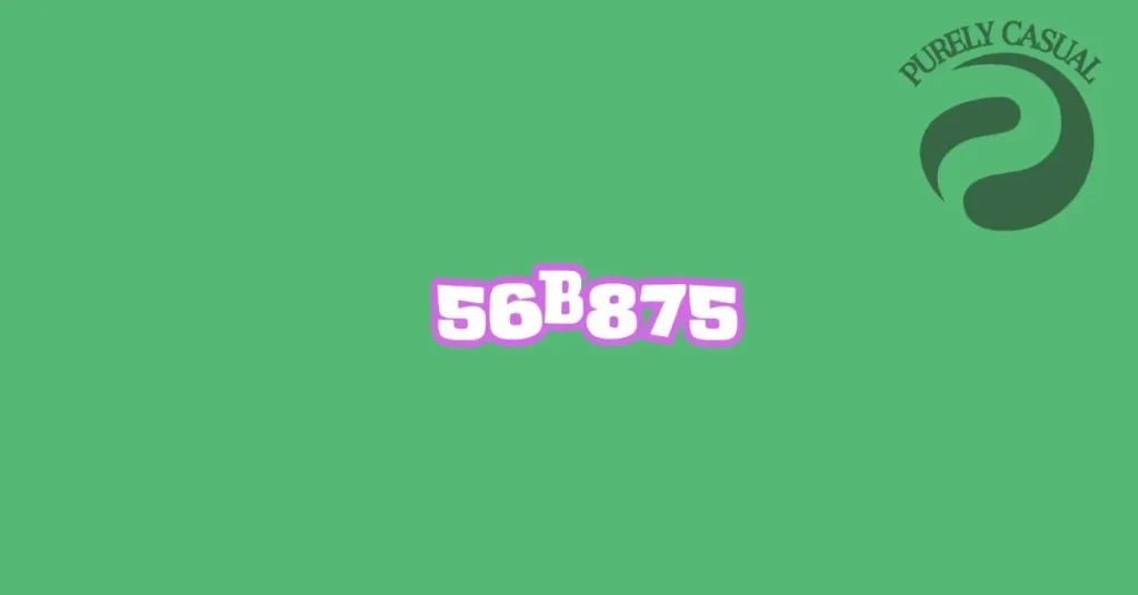
Hex color #56b875 is a unique shade of green. It has a balanced mix of blue and yellow, giving it a fresh, natural feel. In the RGB color system, #56b875 is made up of 33.7% red, 72.2% green, and 45.9% blue.
The CMYK values for #56b875 are 53.3% cyan, 0% magenta, 36.4% yellow, and 28.1% black. This makes it a versatile color for both digital and print design. The color’s hexadecimal code is useful for designers who need precise color matching across platforms.
This shade of green often evokes feelings of growth, harmony, and renewal. Green, in general, is linked to nature, health, and freshness. Many eco-conscious brands choose green shades like #56b875 to emphasize sustainability and organic qualities.
Green hex colors, including #56b875, are popular in web design. They offer a calming, soothing effect, making websites feel more welcoming. This color can also work well in modern designs due to its clean and fresh appearance.
From a cultural perspective, green is seen differently in various parts of the world. In the West, it is often connected to nature and environmental awareness. In some Asian cultures, green symbolizes growth, prosperity, and wealth.
Overall, the #56b875 color code is both versatile and impactful. It is a perfect choice for designers looking to create a refreshing and approachable look in their projects. Whether used in branding, web design, or product packaging, this color brings a sense of balance and harmony.
Table Of Contents
Technical Breakdown: Understanding the Color in Design
RGB and CMYK Values
The hex color #56b875 has specific RGB values. It consists of 86 red, 184 green, and 117 blue. This means it has more green, giving it a bright and fresh appearance.
In the CMYK system, this color is made up of 53.3% cyan, 0% magenta, 36.4% yellow, and 28.1% black. This system is mostly used for printing. These values ensure the color is accurately reproduced across different mediums.
Understanding the difference between RGB and CMYK is important for designers. RGB is used for digital designs, while CMYK is key for print. Knowing these values helps create consistent colors in both formats.
Luminance and Brightness
Luminance is the measure of how bright a color appears. #56b875 has moderate luminance, making it neither too bright nor too dark. This balance makes it versatile for both light and dark backgrounds.
Brightness can change depending on the screen or lighting conditions. For example, on a high-resolution screen, the color might appear more vivid. In print, adjustments might be needed to maintain its look.
This color is also important for web accessibility. Designers should ensure that it provides enough contrast when used with text or other elements. This ensures readability for all users, following WCAG guidelines.
Complementary and Analogous Colors
Complementary colors are those that contrast well with the original color. For #56b875, a complementary color is a shade of orange, like #ffb956. Using complementary colors helps create a dynamic and vibrant design.
Analogous colors are those that sit next to each other on the color wheel. For this shade, these would be other shades of green and blue. Analogous colors work well when you want a smoother and more unified look.
In both cases, designers can create balanced and visually appealing color schemes. Whether using complementary or analogous colors, it’s important to consider how they work together in different design settings.
The Psychology of the Color: Emotional and Psychological Impact
The Power of Green in Design
Green is a color that naturally evokes feelings of calm and balance. The specific shade in question reflects these emotions, with its soothing tone and freshness. People often associate green with nature, health, and renewal.
This color can create a sense of harmony and peace in design projects. It’s often used in wellness and eco-friendly brands. Green is also linked to growth and positivity, making it great for brands promoting sustainability.
In digital design, shades of green like this one are often used to create relaxing user experiences. When used effectively, this color can help reduce stress and improve focus. It’s particularly useful in industries where a calming effect is desirable, such as health, education, and finance.
The Color in Branding
This particular shade is a great choice for companies that want to emphasize environmental responsibility. It can convey messages of eco-friendliness, sustainability, and natural products. Many green shades are popular in branding for organic food, skincare, and technology startups.
For example, brands that focus on wellness and environmental causes can benefit from using this color in their logos or marketing materials. The color communicates freshness and growth, which aligns with these values. Its calm and natural appearance makes it appealing to customers looking for products with minimal environmental impact.
When applied correctly, this hue can strengthen brand identity. It helps create a clear, consistent image for companies that want to highlight their connection to nature or green initiatives. The color builds trust and conveys a sense of responsibility and care.
The Color and User Experience (UX)
Green tones like this one play an important role in user experience (UX) design. This color has a relaxing effect on users, helping them navigate websites or apps without feeling overwhelmed. It is often used for buttons, banners, or icons to guide users subtly.
The use of green in UX/UI design can improve readability and functionality. For example, buttons or links in this color can appear less aggressive, inviting users to explore further. The color also stands out without being too bold, creating a sense of ease while interacting with digital products.
For web design, this color creates a welcoming atmosphere. It’s perfect for websites focusing on nature, wellness, or sustainability. The gentle green hue gives a calming effect, keeping users engaged and relaxed.
Practical Applications: Where and How to Use the Color
Web Design
In web design, this hex color can be used effectively in various elements. It works well as a background color, providing a fresh and clean look. It’s also suitable for navigation bars and call-to-action buttons, offering a calm yet inviting appearance.
Using this color for buttons and links can improve user engagement. The shade stands out without being too aggressive, making it easy for users to find and click on important elements. It creates a pleasant visual experience that enhances the overall usability of the site.
For a nature-themed or minimalist website, this shade fits perfectly. It complements other greens and neutral colors, creating a balanced and harmonious design. This color can help convey themes of growth, health, and sustainability.
Graphic Design and Branding
In graphic design, this hue is ideal for logos, brochures, and marketing materials. It can make a brand appear fresh and modern, aligning with themes of eco-friendliness and innovation. This color is effective for companies that want to communicate a commitment to nature and sustainability.
When designing brochures or promotional materials, this color adds a touch of elegance and professionalism. It’s especially useful for highlighting key information or features. The color can also be paired with complementary or analogous colors to create eye-catching and cohesive designs.
For branding purposes, this shade can help establish a strong and recognizable identity. Its association with growth and renewal makes it a great choice for companies focused on natural products, wellness, or environmental causes. It reinforces the brand’s message and values.
Interior Design
In interior design, this color can be used for accent walls, furniture, and décor items. It brings a sense of freshness and calm to any space, making it ideal for living rooms, offices, or wellness areas. The color creates a soothing environment and enhances the overall ambiance of a room.
Using this shade in home décor can help achieve a modern and natural look. It pairs well with neutral tones and other shades of green, allowing for versatile design options. This color also works well in eco-friendly and sustainable design schemes.
For eco-friendly product design, this color emphasizes a commitment to nature and sustainability. It’s a great choice for products that aim to highlight their environmental benefits. The color conveys a message of care for the planet while maintaining a stylish appearance.
Fashion and Apparel
In fashion design, this color is a versatile option for clothing and accessories. It can be used in everything from casual wear to high-end fashion. The hue offers a refreshing look and can be incorporated into various garments, including shirts, dresses, and outerwear.
When designing eco-conscious fashion, this color reinforces the message of sustainability. It’s perfect for brands that focus on natural materials and environmentally friendly practices. The shade aligns with the values of modern consumers who prioritize eco-friendly fashion choices.
For seasonal collections, this color adds a vibrant yet understated touch. It’s suitable for spring and summer lines, providing a lively and natural vibe. The hue pairs well with both classic and contemporary designs, making it a flexible choice for designers.
Conclusion
The green shade discussed offers a refreshing and versatile option for a wide range of design applications. Its balanced blend of hues makes it ideal for creating a calming, modern look in web design, branding, and interior décor. Whether you’re aiming to evoke feelings of growth and sustainability or simply seeking a visually appealing color, this shade can effectively enhance your projects. Its adaptability across both digital and print mediums ensures that it remains a valuable choice for designers striving for both aesthetic appeal and functional impact.
FAQs
How does this green color perform in web design? This shade works well in web design, offering a fresh and inviting appearance. It can be used for backgrounds, buttons, and navigation elements, enhancing user experience by providing a calming effect without being overwhelming.
What are the best uses for this color in branding? This color is excellent for brands focusing on eco-friendliness, health, and sustainability. It conveys messages of freshness and growth, making it a strong choice for companies in wellness, organic products, and environmental initiatives.
How does this color translate to print media? In print, this shade maintains its appeal with accurate CMYK values. It’s suitable for brochures, logos, and marketing materials, adding a modern and clean look while reinforcing themes of sustainability and innovation.
Can this color be used in interior design? Yes, this color is great for interior design. It can be used for accent walls, furniture, and décor items to create a soothing and fresh atmosphere. It pairs well with neutral tones and other greens, making it versatile for various design schemes.
Is this color suitable for fashion design? Absolutely. This color offers a versatile and refreshing look for fashion, suitable for both casual and high-end apparel. It aligns well with eco-conscious fashion trends and is a great choice for seasonal collections, adding a vibrant yet understated touch.


